
QRIBLY
For our branding and strategy module at Hyper Island my group got the startup qribly. So we were 6 Hyper Island students creating a brand strategy and new visual identity for the client during a 4 week project. This was our journey.
QRIBLY
For our branding and strategy module at Hyper Island my group got the startup qribly. So we were 6 Hyper Island students creating a brand strategy and new visual identity for the client during a 4 week project. This was our journey.
What did I do?
We worked with a flat hierarcy were we are were Creatives. We had different areas of responsibility and my title was Copywriter. I did alot of text work and strategy and I was wingman during the logo work, doing ideation and helping with prototyping. We also did a workshop with the client in which I lead the ones for brand personality and positioning.
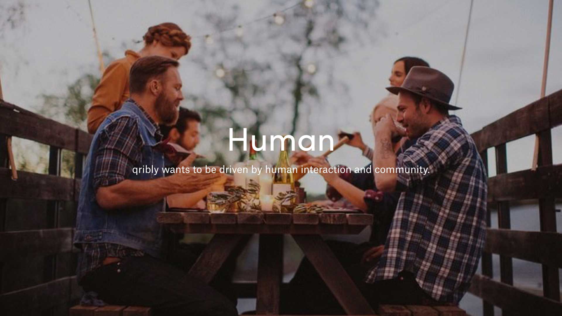
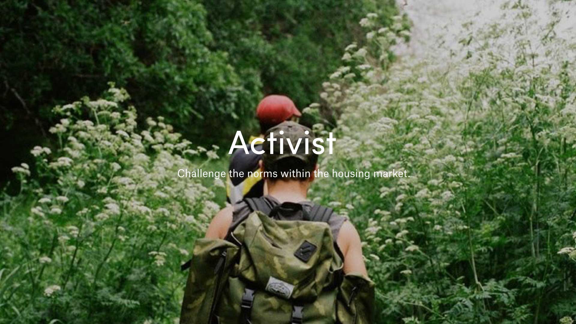
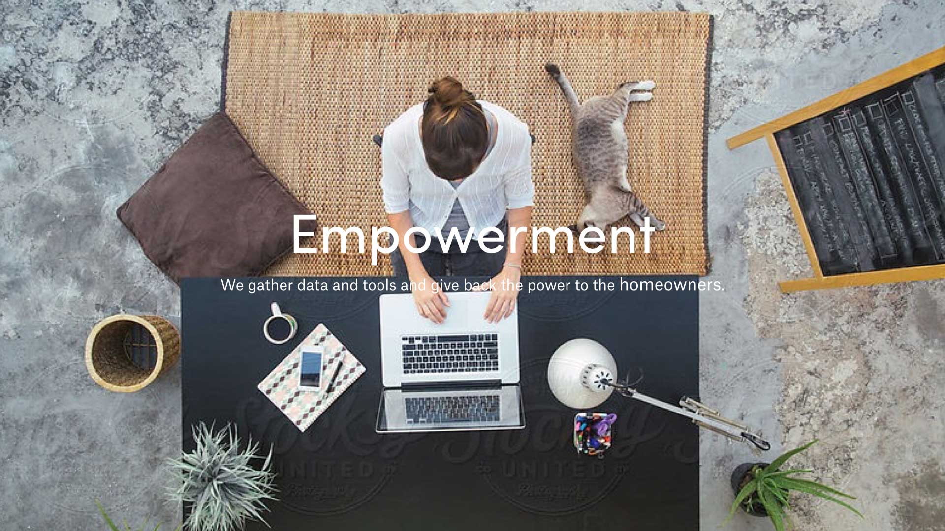
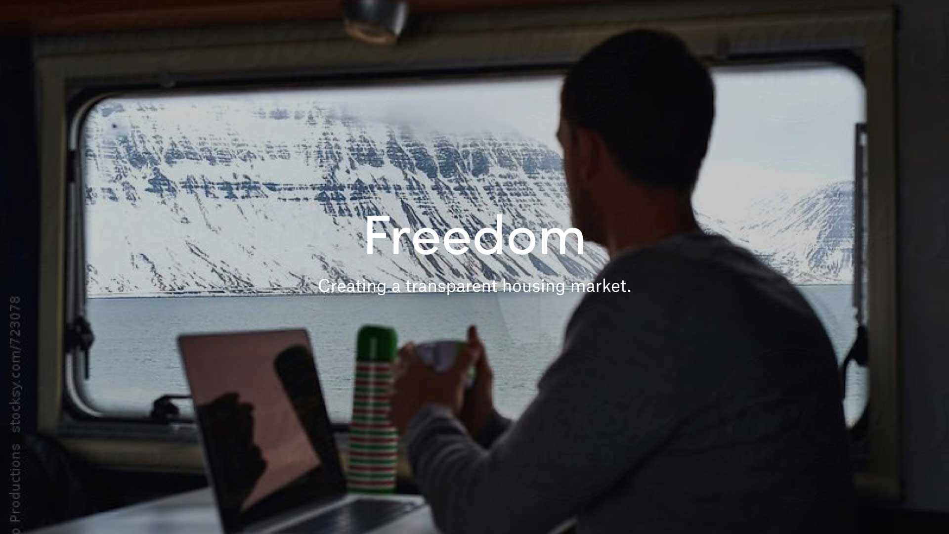
Brand values
Human, Activist, Empowerment, Freedom. We choose these brand values to make qribly more relatable, make them stand out in the crowd of current housing market, but mostly to put them on the peoples side in a market that has a reputation for beeing greedy. We based it all on based the workshop we did with the client and the insights we got from the research on the market and their competitors.
Animated logo
We wanted to try out a animated logo, so we did!
We decided to show how the logo can animate into different elements that represents the client. As a person for the human touch, heart as the passion for the homeowner and of course a house. The logo concist of a typeface that is clean and trustworthy but we rounded ut of a bit to create a friendly look. The dots represent the way the client handles data and plays connect the dots together with the users.